Friday, February 19, 2010

"Significant" Values


The key terms used in describing light when metering are highlight, middle values and shadow. Highlights are the brightest parts of the scene; shadows are the darkest; and the middle values lie between.

Highlights can be broken down into two main types--the principal, or textural highlight, and the specular highlight. The principal highlight is the brightest part of the scene in which detail, or texture is to be recorded, while the specular highlight is just bright tone (brightness) with no detail or texture. It may "read" on the print as paper white (the brightness and color of the paper base), something you usually want to avoid with large areas within the frame.

A principal highlight might be a freshly-painted picket fence in which you want to show the grain of the wood, or an adobe wall which has been freshly plastered. This highlight needn't be bright white; it is just the brightest value you are recording with detail or texture in the frame. A specular highlight has no texture. It can be the glint of light off an afternoon lake, or the glare from a glass-and-steel skyscraper. There is no recording of detail in this tone--it is pure light, or bright white in the print. Having some specular highlights is great--in fact, it is what often gives prints "sparkle", and you can preview them being forced into the image by holding down the ALT/Option key as you pinch the Levels slider, for example.

The other end of the brightness scale is the shadow area. The key term here is "significant shadow detail", or the darkest part of the scene in which you want to record visual information. There may be darker parts of the scene, but these will record as tone (deep gray to black) without textural information or detail.

These terms, "principal" and "significant" are interchangeable, but are very important to keep in mind when making exposures. While we do have a wide recording range on film, and must make every effort to control highlight exposure with digital, seeing the image in terms of a tonal spread, and how that spread will record, is key to making good exposures.

For example, say you are photographing a white car in bright sunlight. You take a reading off the white hood and roof and get f/16; you read the shadow cast by the car and get f/4--this presents no exposure problem, as long as you bias the exposure towards the highlight and shoot at about f/11. However, you also take a reading from the tires on the car in the shadow area, and get a reading of f/2; this is clearly out of range and you might have to resort to some fancy shadow retrieval work to get any detail back, though it is often not worth the noise and bother.

The question then becomes, is it important to record detail in the tire tread, or can the tires record as pure black (with no visual information other than tone?) If the answer is that the tires may record as pure black, the significant shadow detail is the information in the cast shadow of the car. If no, then other steps must be taken to record both the bright car and the tire tread. These steps may include adding auxiliary light (fill flash); using a reflector card to bounce light into the shadow area; or exposing so that the tires become the significant shadow area, then compensating for the overexposure of the highlights by making another exposure and then combining the two later. Or, with film, it might mean reading the shadow area in which you want detail, dropping two stops and then underdeveloping by from 10-20%.

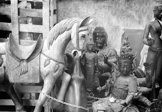
Photo and text copyright George Schaub 2010. Seeing and reading scenes for "significant" areas of highlight and shadow is the key to good exposure. In this still life the textural quality of the objects is defined by how the brightness values are placed on the exposure scale.

Thursday, February 18, 2010

Film Specs and Comments: Kodak T-Max 100


T-Max 100 continues to be a very interesting and useful film onto itself and a very good film for scanning. One problem with this film has always been exposure and development procedures, as it tends to block up highlights. I have always suggested slight underexposure and then complete development; rate it at EI 200. This can pose problems though depending on how you read light. Easier perhaps is bias for the highlights, like with slide film and even digital cameras. Blocked highlights (excessive density) are certainly a problem when scanning.

The specs here are an excerpt from the Black and White Data Guide I wrote in 1994 with some updated comments.

Kodak T-Max 100

Designation: Professional: 35mm, code 5052; 120, code 6052; sheet film, code 4052

Speed: ISO 100

Color sensitivity: Panchromatic

Reciprocity effect: For a 1/10,000 second exposure add 1/3 stop. No compensation required in 1/1000 second to 1/10 second range. For a 1 second exposure add 1/3 stop; for a 10 second exposure add 1/2 stop; for a 100 second exposure add 1 stop.

Grain: Very fine

Degree of enlargement: Very high

Resolving power: 200 lines/mm

Exposure latitude: +3/-2 stops (update note: stated specs, +3 is ridiculous, I'd say more like +1.5-2EV)

Contrast: Medium/ medium high

Processing: T-Max developer at 75-degrees F, 6-1/2 minutes; D-76 at 68 degrees F, 9 minutes; HC-110 (dilution B) at 68 degrees F, 7 minutes. For sheet film: tray processing, D-76 at 68 degrees F, 9-1/2 minutes

Push processing: At EI 200 no compensation in processing is required. Develop normally. For EI 800: T-Max developer at 75 degrees F, 9 minutes; D-76 at 68 degrees F, 11 minutes. For EI 800: T-Max developer at 75 degrees F, 10-1/2 minutes

Uses: A professional black-and-white film with exceptionally fine grain, excellent sharpness. Useful for all applications when a high degree of enlargement is required

Comments: The only complaint printers seem to have about this film is that it's often difficult to locate grain to focus upon. It produces very sharp images even when big enlargements are made. It also can be used to copy black-and-white photos and for photomicography, as well as an internegative and inter-positive film. It is excellent when fine details are important.

(Update note: Do not over-develop and test for speed rating--your personal EI--to avoid blocked up highlights.)

Tuesday, February 16, 2010

Tonal Play


A photographic print has a certain rhythm--a flow of tonality, exposure and contrast that creates a cohesive image. If you open the shadows but have burnt up highlights all that flow is lost; if you have an obvious direction of light but there is a sudden intrusion from another unexplained source then the eye will reject the scenario. I’m not talking about special effects printing here, where all bets are off, where discontinuity of values can actually aid the communication, but about a more “classic” approach to the photographic print.

In addition to paying attention to this rhythm you should also consider certain tricks of the printing trade, including edge burning, center of light and breaking up fields of like-valued detail with some discrete lightening and darkening. I’ll start with the direction of light.

If you look at a number of prints closely you might notice that there is a certain direction of light within and through the image. The story goes that the film director Erich von Stroheim always lit Marlene Dietrich brighter than any other person or part of the scene. Apparently, von Stroheim would have one lighting technician follow her throughout the scene always throwing light on her face and form. This created a glow about her that became part of her screen legend.

This doesn’t mean that your main subject should have an obvious spotlight on it, but that you should pay attention to how light is handled within the scene and how it can be exploited to add subtle emphasis to your main subject. This becomes clear in portraiture, where always having the subject’s face lit brighter than the surround both focuses the eye and creates a dimensional feeling of space and volume. It also can be applied in scenics, close-ups and abstract studies. Think where the light source is coming from, about the character of that light and how you can treat the surrounding area to add just a touch of emphasis to the subject you want to enhance and draw the viewer’s eye to in the picture.

There are numerous printing tricks that can aid this process. Edge burning, for example, is a tried and true printer’s trick for bringing the eye to the “center” of the print. This is also a subtle touch, where the edges of the print are made slightly darker than the center, or main subject in the scene.

Another trick is to create visual rhythm by carefully using burn and dodge controls in areas of like tonality. This can serve to break up what might be a monotonous block of tonal values into something more attractive to the eye and make it a source of visual enjoyment rather than a placeholder in the print. For example, say you have a scene where a field of ferns that is consistently lit sits in the foreground of a deep forest scene. Rather than have a solid block of tonal values you can burn down areas, emphasize shadows and thus elevate highlights to make the area even more visually engaging. This technique can also be used on clouds, in water and even in portraits.

Photo and text copyright George Schaub 2010. The light falling on this rock face was fairly consistent. Selective burn and dodge controls varied the "density" and brought the center of light to the near upper right axis of the frame.

Wednesday, February 10, 2010

Compressed Tones


Even if you expose in the camera correctly there's a chance that the scene brightness values will become muted, compressed or lost. You can also lose values due to improper scanning (too dark, too light, or too much contrast) or printing (too much or too little contrast, too light or dark). Usually, the main problem is flattening, or compressing the potential tonal scale, and that can come from too little, or too much contrast.

To use a musical metaphor, if we record a concert on a hand-held tape recorder and play it back hoping to recreate the sound of the full orchestra we’ll be disappointed. The loss of fidelity in our recording and/or playback may flatten the bass notes and mute the treble notes; flutes may become shrill, while the distinction between our bass fiddle and tuba may be lost and come out like a deep blah. That’s what can happen in printing as well, but in visual terms the highlights may all merge into a harsh white, and the shadow, or deep tonal separation, may lump into a dark mass. We may even compress the tonal scale so much that all the tones come out in a gray mass, with little or no distinction between them, and create a kind of veil over the image.

Actually, there is some inevitable loss when we translate a recorded image to a print. Visually, we see the image on the screen backlit and the image on the print via reflected light, which alone accounts for some of the loss. There’s also some loss in the mere recording of the scene, such as when the brightness value range exceeds the recording capabilities of the film or sensor. In addition, all photographic media "sees" somewhat differently than the eye, and may indeed be blind to some tonal separations in the original scene.

But even with some of these built-in hindrances, you can maximize the materials by paying attention to, and learning about the limitations and working through or around them. Once you do, you'll begin to see how the fullest possible tonal scale can be recorded and eventually brought to play in the print.


When a print is made, the flow of light to dark in the recorded image can be enhanced or corrected in many ways. In addition, selective areas within the scene can be made lighter or darker, or be given more or less contrast. Classically this is called "burning" (making selective areas darker, or “bringing down” values) or "dodging" (making certain areas lighter, or “opening them up”.) Once we get an image into the digital darkroom we have a great many ways to control, enhance and even correct the tonal variety and richness.

Photo and text copyright George Schaub 2010. High contrast scene might cause some loss of details seen by the eye, but at times this serves the intent of the image and is eventually how we "see" photographically. Yes, we can use multi-exposure and processing techniques to bring detail into the deepest shadow and brightest highlights in the same image, but that is not always what the image, and your expression of the image, call for.

Tuesday, February 9, 2010

TONAL SCALE


Tonal scales are the blacks, whites, and shades of gray we have available in black-and-white image making. Your most important technical job when you take a picture is to record as full a range of these tones as possible. You can't create tones (especially the information they hold) on the print that don't exist on the negative or in the image recorded by the digital sensor onto your memory card.

When you make an exposure you are recording brightness values that exist in the scene. Bright areas are called highlights and darker areas shadows. The “significant highlight” is the brightest area in the scene that contains texture (as opposed to “spectral highlights”, which are glints of light like that those sparkling in a pond in the late afternoon); significant shadow values are the darker areas in which detail or image information appears, as opposed to deep shadows, which are just deep tones without detail, like the shadows cast on a bright day.

Of course, your recording contains more than just bright and dark areas-there's a whole range, or scale, of tonal values in between. These go from near-black to near-white, with all the myriad shades of gray. Some photographers differentiate these shadings into eleven Zones, numbered 0 through 10 (with 0 being pure black and ten being pure white.) There are of course many more steps or better stated a full gradient possible. Most importantly, regardless of how you slice it, the tonal scale recorded during an exposure defines the range of possibilities within the print. Have a broad scale of tones, or in film, densities, and there's a good chance you can generate same on the print. There are simply more options, both creative and corrective, when you record as many of the brightness levels within the scene as you can, and as the medium allows.


Photo copyright George Schaub, 2010. This print shows a full range or scale of values from deep shadows to textured highlights.


Sunday, February 7, 2010

The Black-and-White Photographic Print


You could define a successful print as one that communicates the thoughts and feelings of the photographer at the moment the shutter is snapped; it is often a faithful rendition of the quality of light that appeared in the original scene.

Many prints, however, are refinements of the moment, and can even be quite different “reinterpretations” of the scene. These refinements are made in order to enhance the image, or to add further visual expression; the reinterpretations are made as the photographer explores the visual possibilities of the image, and finds new forms or ways to go deeper into the image beyond what was glimpsed, or intuited, when the shutter was first released.
The ability to enhance the moment, or to reinterpret the vision, is one of the most exciting aspects of the art and craft of photography. The artistic freedom this brings is the key to both enhanced communication through photography and the place where even greater creative forces—introspection and retrospection—can be brought into play.

Friday, February 5, 2010

The Black-and-White Print


The wonderful thing about digital black and white printing is that any type of image can be used as its source. Converting from color digital images, color film and even color prints presents little problem, and is much easier than doing so in the old, chemical darkroom. But what makes for an effective print is another matter. Just what is a successful print? It’s one that communicates the thoughts and feelings of the photographer at the moment the shutter is snapped; it is often a faithful rendition of the quality of light that appeared in the original scene.

However, most prints are refinements of the moment, and can even be reinterpretations of the scene. These refinements are made in order to enhance the image, or to add further visual expression. The reinterpretations are made as the photographer explores the visual possibilities of the image, and finds new forms or ways to go deeper into the image beyond what was glimpsed, or intuited, when the shutter was first released. This is especially true of black and white prints, where so much visual experimentation can be explored. This is in no small part due to the removal of color and the ability to express with texture and tone rather than color. The artistic freedom this brings is key to the ability to communicate photographically.


Black and white requires involvement--it is not like digital snapshot photography where the memory card can be placed into a printer and prints are automatically made.

Color and Black and White


When photography was first widely practiced, there were those who immediately sought ways to make color images, or who insisted that color be added through paints, toners or dyes. It is often surprising to see just how much color was daubed onto nineteenth century images; it's like first learning that many ancient Roman or Greek statues were painted, and often gaudily at that. The images of the nineteenth century were dutifully colored by freelance artists and by painters employed by photographic studios. Understandably, the lack of color often bothered these photographers, as it did the consumers who wanted a natural portrayal of themselves or their loved ones. And, if not colored, the prints were toned, sometimes in imitation of painters, other times to remove the cold, metallic rendition of the photographic image itself.

We look at these images as quaint, but only because we now have the ability to choose between a color or black and white image with such ease. And now that color is with us the black and white image stands as a unique visual form that needn't stand in as the base for colorized images. Now, when we choose to color a black and white image, or to add tone to it in some way, we do so to add to its expressive qualities, and not merely to make up for lack of color.


All this does not mean that it's a color versus black and white debate; there are no sides to be taken and defended. It's more a matter of appreciating the artistic pleasure that black and white affords, and beginning to understand the visual dynamics that make it unique. The aim of any print is to create images that will touch the viewer and serve as an expressive vehicle for the photographer.

An Appreciation of Black-and-White


What is it about black-and-white that makes it such a compelling visual medium? In terms of pure visual enjoyment, there is the beauty of the tonal values-the shades of gray and the deep blacks and bright whites--that express the play of light and shadow. The tones are versatile, and can represent a stark or subtle ambiance with equal power. Black and white also allows us to see without the distraction of color; this often means that we can approach the heart of a matter, or of a design, in its purest form. For the digital photographer, black and white offers a great deal of creative freedom.

There’s no question that color printing is the dominant form of printmaking for digital photographers today. Indeed, when color became available on a mass scale in the middle of the twentieth century, there were those who claimed that black and white was a medium whose time had passed. For the snapshot photographer and mass-market photography, this was mostly true. But the dedication to black and white among artistic, fashion, journalistic and, increasingly, commercial photographers continues to grow.

All photography, color or black and white, is an abstraction and an illusion. The heart of the abstraction is in the representation of a three-dimensional world in a two dimensional space--the print. But black and white images are particularly evocative, and hold a special place in the cultural and social history of the past one hundred and sixty years. We all share in the range of feelings that black and white photographic images bring forth, from the nostalgia we feel when viewing old family photos or classic black-and-white movies. We also think in black and white as a recorder of our history, especially when we bring to mind the news photos and portraits that have become icons of their age.

Even with these old associations we also see black and white as a very modern medium, as it communicates abstraction with ease, even if just in its monochrome rendering of a colorful world.

This ability to express and communicate a wide range of feelings is what makes black and white such a fascinating medium in which to work. It is in many ways a free form that encourages interpretation and variation, but it is also a discipline that takes study and work to get right. It is accessible, yet when explored deeply is as challenging as any visual form of art.