Sunday, November 14, 2010

Avoid Clipping in Contrast Adjustments


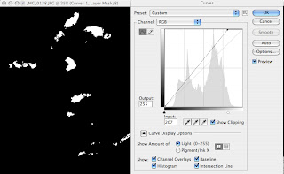
Clipping is what happens when you under- or overexpose and image in camera or over-correct in software. It simply means losing information or detail in that area. When you photograph you can use the highlight warning control (or the “blinkies”) to check for clipping as you work. You can also check for clipping as you work on images in software, especially when doing contrast correction or change. If you look at the Curves control you’ll see a check box that says “Show Clipping.” Check that ON and as you move the sliders the screen will go blank, dark for the highlights and white for the shadows. As you move the slider in toward the shaded histogram you’ll see details emerge—these are the clipped areas.
It is important not to create harsh edges in highlights, say on the bright clouds, when making contrast adjustments. This Curves dialog box shows the Show Clipping box ON. When an adjustment is made to the highlight area the clipping begins to show on the image (which has been masked with black) on the details where over-correction is applied. You can also see clipping in Levels by pressing down on the ALT/Option key when making adjustments.

Wednesday, March 17, 2010

Scanning for Black and White


Many of us who worked prior to the turn of the century, and even somewhat around that bend, shot with film. The following is for those who still work with film and combine film exposure and development with digital scanning and printing, to me a very good course to follow, and for those who have older film images they want to print or digitize. While I now photograph mostly with a digital camera, I also have lots of “legacy” film to work with, and recommend scanning and inkjet printing as the most sensible and creative means to realize those older images.

The main thing to keep in mind when scanning is to “do no harm.” There are various schools of thought on this, but my approach has always been to get as much image information out of the film as possible without doing any, or many corrective procedures beyond that which the scanner might offer. The scanner is there to pull information out of the film record and turn that information to digital form. Scanner software can enhance that information or add to it; use it to record, not overly enhance. You should also scan at the maximum optical resolution of the scanner, and not to work with “interpolated” resolution, that is, to not add to the information through algorithms. If the scanner you use does not create the amount of information you require for your prints—in other words, produces less resolution that you need for a particular image size—then get another scanner or have the images scanned by a pro lab.

Scanners vary greatly in their specs and capabilities, and new models come out periodically, so I will not recommend or follow a particular hardware and software here. While dedicated film scanners (strip and sheet) will yield better results, a new generation of flatbed film scanner (for reflective as well as transmissive material, i.e., film) has changed the thinking on the need for a dedicated film scanner for film scanning. My choice is to work with a dedicated film scanner for 35mm and I use a flatbed for medium format.

It is a fairly simple matter to convert any color image to black and white, so you can scan color slides to color (RGB) or to black and white (grayscale) data. Most scanner software shares similar settings. You start with choosing the type of film then put in how you want the scanner to handle the film. You can scan at 16-bit grayscale, which pulls much more information than an 8-bit scan or even in color, and then convert later in software to grayscale. You then put in the “output” size, which is final print size, and also the resolution, usually 300 dpi. The software calculates the rest. Keep in mind that if you are scanning solely for black and white, choosing 48-bit color increases file size substantially.

Many scanners offer presets of various sorts, which you should test to see if they help or hinder your work. These vary from presets for film profiles, such as various types of slide and color negative films, to tone curve and color cast renditions, which can affect black and white conversions.

The mantra is “do not harm”; don’t add contrast, try to fix every exposure flaw etc in scanning. Get all the information you can from the film and then work the problems later in software. If you keep the tonal richness and detail of the original in your scan you allow the most leeway later in your image interpretation, or best chance for an faithful reproduction of the scene. It’s the same gospel as that of camera exposure. Even slides that have begun to lost dye integrity over time can be “salvaged”for black and white printing.

8 Scanning Tips

1) When scanning color negatives or slides you can scan for color or black and white. It’s easy to convert to black and white later in image editing software.

2) Scan at the highest bit depth available.

3) Test the dust and scratch removal software in your scanner to see if and when it causes unsharpness. It can help save retouching time later (except on black and white negatives and Kodachrome slides, on which it usually does not work.)

4) Scan for the highest non-interpolated resolution you think will be necessary. Do not resample in the scanner software. Never exceed the scanner’s optical resolution.

5) DO NO HARM. Do not try to enhance contrast too much or fix contrast or exposure problems; save that for the image editing software.

6) Watch for highlights. If necessary, do lower contrast in the scan phase. You are collecting information, and if you do not record the information in the scan you will not have it to work with later.

7) Think big, but be reasonable. There is a limit to how big a print you can make from various size format film. Test to see the limits of your scanner and don’t expect to solve all your problems in the scanner phase of things.

8) Scan neutral, create in software later for expressiveness.


Photos and text copyright 2010 George Schaub: Scanning can help preserve even faded or dye challenged slide film. This old Ektachrome slide was undergoing a magenta shift, but scanning it for b&w printing allowed the image to be useful again, and a nice print resulted.

Monday, March 15, 2010

High Contrast Prints: Digital and Analog


High contrast printing involves eliminating or subduing the middle tonal values, thus producing an image where the visual information is communicated in tones of pure black and white. High contrast can be used to make near line-drawing renditions, or to create highly graphic interpretations of a scene. As it mutes information in the middle values it accentuates the lines and forms that define the subject.

Virtually every image can be printed in high contrast; critical and aesthetic decisions, however, will limit this technique to certain moods or scenes. Fashion, urban landscapes, portraits, architecture and winter scenes are the most common types of images on which high-contrast techniques are applied, but this by no means limits the possibilities.

First we’ll discuss printing in the darkroom, then with computer processing. The simplest way to achieve a high contrast effect is to work with a high-contrast paper or high-contrast filter when using VC paper, namely a #5 grade. With most negatives, this choice eliminates many of the middle gray values.

Unlike more commonly used grades, such as #2 or #3, grade #5 has a rather narrow exposure latitude, which means that critical testing is key. Expose too long and the whites will "gray up"; underexposure may yield a very weak image. (#5 can also be used to correct very underexposed negatives, and will often reveal details not seen by the untrained eye.)

If even a #5 grade fails to yield the desired result, use of a "lith" film as an intermediary will do the trick. Lith (also called ortho) film is available in formats from 35mm up from specialty shops like B&H. This film is made for document and line drawing recording; when developed in a special high-contrast developer no middle gray values will record.

You can also make an inter-negative from an original negative or slide. To make it from a slide, all you need do is enlarge or contact print the slide onto the lith film, just as you would make a print. This will create a reversed, or negative image, which you can then use to make a positive print. To make a lith negative from a negative, first enlarge or contact the negative onto the lith film, and then enlarge or contact that positive onto another sheet of lith film, which will create a negative. (All photo imaging, when done on film or paper, goes negative-positive-negative-positive, and so forth. This allows for some interesting image derivations.) Lith film can be processed under red safelight conditions, so you can inspect the negative as it develops to get it just right.

Once the lith negative is created, you can retouch it with dye to eliminate any gray values that may still exist; when you opaque a negative that opaqued area will print white. After you're satisfied with the negative you can print on virtually any grade paper to obtain a high-contrast image, though a #5 will guarantee the best effect.

For those who want to work in the computer just take the image file and open up Levels or Curves and pinch in the sliders. This is like printing on a higher contrast paper. Another interesting effect is using the Threshold command (you can do this as an Adjustment or an Adjustment Layer) and use the slider to determine the look. This is pretty much a visual fix and is a very simple and fast way to do it.

High contrast does not always mean just black and white; there may be an alteration of tonal values to accentuate a "hard" contrast with some gray values remaining. This effect can be used effectively for all manner of imaging where you don't want a line-drawing effect yet want the graphic appeal of a higher-than-normal contrast image.

Photo and text copyright George Schaub 2010. This image was scanned from a high speed color slide film, then made hi-con via a Threshold New Adjustment Layer in Photoshop.

Friday, March 5, 2010

Hand Work on Negative Printing


This entry is for chemical darkroom printers, but those who print strictly digital might find it of interest as well, as it covers some of the same techniques, and even terminology, used for inkjet work. It takes up the discussion after the test print stage where overall exposure time has been determined.

After you have determined the proper overall exposure time for the negative, you may discover that certain tonal areas are not reproducing to your satisfaction on the print. For example, some highlights may be too harsh and lack detail, or some shadow areas are blocked up and lack separation. Before you go on to any mechanical steps to correct this problem, recheck your testing procedures. First off, take another look at your negative. Are there tones available that you just don't see in the print? Have you squelched your values to the point where the sacrifice is too great? Is your paper contrast grade too high or low? If it's too high, you may be causing a blockage in highlights and/or shadows. If it's too low, your highlights may be fine but your blacks are weak or, conversely, your blacks are fine but your highlights lack sparkle. Is overall exposure time correct?

Recheck your test strips and ascertain whether another time may yield a better tonal scale. If all these backup checks don't reveal the source of the problem you may simply have a situation where the negative itself doesn't have the information you need, or the contrast of the negative is such that a normal printing paper simply can't handle the range of tones. This is when dodging or burning in may come to the rescue.

DODGING
When you hold back the light from a select portion of the negative as it's being projected onto the paper you are dodging. Generally you'll need to dodge during printing when you fail to compensate properly for scene contrast in film exposure. A typical situation that forces dodging is when your principal subject is highly backlit, or when a portion of a subject is obscured in a bothersome shadow, such as under the brim of a hat. In each case, the area to be dodged has not received enough exposure, and is quite underexposed in relation to the rest of the image. You also may have to dodge a portion of a landscape scene when, for example, the sky is quite bright and the land becomes underexposed because you failed to compensate, through exposure or filtration, to bring the brightness values into a printable balance on the film. Whatever the reason, dodging is always used to help bring detail into underexposed shadow areas, as it keeps the darker tonal areas from being overexposed, or printed too dark on the print. This is accomplished by holding back some of the printing light during the overall exposure.

Dodging should never be overdone, as too much will destroy the tonal integrity, or flow, of the overall image. Shadow areas are truly darker than the rest of the image, but they shouldn't be weaker in tonal rendition. An over-dodged area will stick out like a sore thumb, and will look "muddy" and weak. Better to dodge with a light touch; better yet to work it out in negative exposure.

The best dodging tool is a small piece of cardboard taped to the end of a flexible, but sturdy wire; a thin coat hangar wire works admirably. Before you do your final print, practice a bit with the focusing light on. Place the end of the dodging tool between the light source and projected image and cover the area to be dodged. Now feather, or move the blocker back and forth quickly over the area. Don't just place the blocker over the area and hold it there-you'll create a tonal edge that's simply too forced and obvious. Work it like a swivel stick and keep stirring.

There's no hard and fast rule about dodging, but it's usually best to limit dodging to less than one-quarter of the total exposure time; any more and the effect may be too obvious. Thus, if total exposure time is twenty seconds, dodge for no more than 5 seconds. If you still can't get detail in the area you may be working with a lost cause and/or may be working on the wrong contrast paper for that particular negative. Experiment with a number of prints to get the right proportion of dodging to overall printing times. If you blend your light well you may be able to get away with a higher proportion of printing to dodging time.

BURNING-IN
When you add exposure to select portions of the print over and above the tested printing time you are burning-in. Generally, you burn in to add detail or texture to highlight areas, although you may also burn in dark areas to get blacker-blacks or to obscure shadows areas for a more dramatic presentation. There's also a technique known as edge-burning, which adds a subtle touch of exposure to the sides of a print.

First off, follow the same double-checks discussed in dodging to make sure that the cause of your problem isn't improper paper contrast selection or too little printing time. If the contrast is too high you may have good separation in your shadow areas but harsh highlights; if the printing time is too little your blacks will be weak and there will be no details even in mid-highlight areas.

In general, you'll be burning in to counter the harshness of contrasty scenes, where the brightest tonal areas (those areas on the negative with the greatest density) print with little or no detail. Subjects may include artificial light sources in low light scenes, reflections from metallic objects, and any area that receives too much exposure on the negative vis a vis the rest of the image, thus causes an imbalance of densities.

When you add exposure time over and above the normal exposure you are adding print density to select areas. This is accomplished by allowing light to hit certain areas of the print while holding it back from the rest of the projection. You can do this with your hands, with holes cut out in opaque cardboard, with the edge of a board, or by using templates, or forms cut out to match the areas that are to be blocked. Let's look at these one at a time.

If you've ever used your hands to make shadow plays on a wall you have an idea of what a versatile tool your hands can be for burning-in. Nearly any shape can be created by manipulating your fingers and palm, from straight lines to curving arcs. In addition, you can use both hands to create a funnel of light and can vary the amount of light going through by simulating the aperture on a lens by moving your hands in and out. Hand burning-in takes some practice, but as you gain experience you'll find it's very flexible.

The most common way printmakers burn in is with a hole cut in a piece of opaque paper or cardboard. Once the area to be burned in is identified, you cut a hole out in the paper or card that corresponds to the area (the larger the area, the greater the diameter of the hole), place the paper between the light source and the paper and feather the light onto the area. As you'll see, the farther away you hold the card from the paper surface the greater the area of the projected circle of light; it works just like a cone. Two tips: 1)Make sure that the burning in tool is quite a bit larger than the printing paper on which you're working; this ensures that you'll have no unwanted light leaking over the edges of the burn card onto the edges of the printing paper. 2) Burn by blending the light onto the area rather than just holding the burn card in one spot. As with dodging, creating a "no seam" look, where tones flow from one area of density to another, is critical.

One advantage of working with an opaque card is that you don't have to watch the light hitting the paper on the easel itself. By holding the burning tool above the easel you can see exactly where the light is playing on the surface by looking at the card itself. Naturally, having a white card helps. This close-hand viewing is an invaluable technique, as it makes what can be a clumsy experience into a smooth operation.

You can also use a card to burn in edges, corners, or a large horizontal or vertical area of the print (such as horizon lines). In this case you use the same blending, or feathering technique to get a flow of tones. Again, watch the areas not getting additional exposure on the surface of the card.

The last technique for mechanical burning-in is used when a highly amorphous shape, or unique form, must get additional exposure. (This can also be used for dodging.) Here you'll be cutting an opaque template of the area by laying a cardboard or thick paper on the projected print and sketching out the form. You then cut out the form and place it over the printing paper during exposure. If you use this technique, keep in mind that you may have to do additional blending with the small cutout burn card to keep the tonal borders from looking false. This is a tricky technique that requires practice to get right.

You can also burn and dodge and get varying grades of contrast on the same print by using a split-filter printing technique with variable-contrast papers. This opens up even more possibilities for solving underexposure (dodging) or overexposure (burning-in) problems, and is a way of solving some problems that can't be handled with a graded contrast paper.

Let's say that you have a difficult negative, one that has a contrasty background sky (one that neds a lower contrast to bring out detail) and a slightly underexposed foreground that would normally call for a 3# grade. This is a fairly common negative.

One way of dealing with this situation would be to boost the overall contrast with a #3 filter, then burn in the sky. This may work well, but too much burning in may result in a flat look to the print, even though the exposure is correct. With variable contrast papers you can make the first exposure for the foreground with the #3 filter, then, being careful not to bump the enlarger or changing the focus, replace it with a #1 filter. You then make a second exposure to activate the low contrast layer in the variable contrast paper, dodging the foreground with your hand or an opaque sheet of paper as you do. This takes full advantage of both contrast layers in the paper.

How much burning in should you do? As much as necessary to get the tones right. If you're shooting in a very contrasty lighting situation and can't or don't balance exposure accordingly, you may have to burn in as much as two or three times the overall exposure; even then you may have to go more. But if you find that you always have to burn in anytime you shoot on a bright day you probably are creating your own problems-check your exposure and/or film development procedures.

Copyright text and photo: George Schaub 2010
This original was exposed on Tri-X at -2 stops from the significant shadow reading and underdeveloped 10% in D-76 1:1 at 9 minutes to try to hold back density on the highlights. The shadow details were fine but the highlights were quite "hot." The contrast was resolved by burning in the foreground and top of the image. BTW, each lightbulb in the shadow areas was burned in using a small cutout in cardboard.
Wednesday, March 3, 2010

Grayscale Step Wedge


One advantage digital printing has over the conventional darkroom is that you can see on the monitor how your tonal scale—the range of black to white and all the shades of gray between-- will be reproduced. The main problem for most printmakers is that they tend to make prints with too much contrast, thinking that this will enliven their images. Too much contrast means loss of highlight detail and a harsh looking print. The advantage we have with digital printing is that we can measure and even predict when no ink will land in a spot and when we’ll get paper rather than ink occupying space within the frame of the image.

With conventional paper printing you can fog the highlights slightly to add tone. In digital printing you create highlight density through ink. A thin shot of ink, to be sure, but you still do it with ink. If you can train yourself to watch for the highlights and to be able to measure for them and preset your printer to always catch them you’ll go a long way to solving one of the main problems of digital printing.

The same goes with shadow detail. You may see the shadow detail on your monitor but when you make a print they go to tone and lose detail. Or all the lower values bunch up and overlap. This type of print output is unacceptable, especially when it is so easy to overcome. Of course, if the digital image files does not have these tones (or gray levels, if you will) then we cannot get them on the print. Burnt up highlight pixels will just go gray and lost shadow detail will just reproduce as dark tones. But if the detail’s in the scan or digital file it should be able to be reproduced on the print.

One way to work with tonal values is to create a grayscale step wedge, check it on the monitor and print it out. Open a New file in Photoshop and make it about 5x7 inches at 150 dpi. Make the file in grayscale or RGB mode.

Once you have done that create a selection within the blank new document using the rectangular marquee. Do not feather the edges at all.

Next click on the gradient tool and set the default of black/white in the foreground color box opener, if necessary. Now hold onto the shift key and draw a line from one end of the New file window to the other, making sure it is a straight line and that it stops at the edges of the box. You should see a smooth grayscale gradient from black to white.

Now go to Image>Adjust>Posterize and choose 11. Now look at the scale on the screen and see if you get separation between the tones and that your white has texture.

Check if and where you begin to lose information in the step wedge. How many steps back does the white and black areas begin to differentiate (in other words where does the tonal separation start to take place)?

If you have a very harsh, contrasty image there is something not right with your monitor settings. If the grayscale is bunched up there is too high a contrast setting.

Save the step wedge you’ve made and call it up once in a while. I know some printers who keep it as a constant companion on their screen, although I find that there’s enough screen info to deal with without the step wedge sitting there.

Copyright George Schaub 2010

Friday, February 19, 2010

"Significant" Values


The key terms used in describing light when metering are highlight, middle values and shadow. Highlights are the brightest parts of the scene; shadows are the darkest; and the middle values lie between.

Highlights can be broken down into two main types--the principal, or textural highlight, and the specular highlight. The principal highlight is the brightest part of the scene in which detail, or texture is to be recorded, while the specular highlight is just bright tone (brightness) with no detail or texture. It may "read" on the print as paper white (the brightness and color of the paper base), something you usually want to avoid with large areas within the frame.

A principal highlight might be a freshly-painted picket fence in which you want to show the grain of the wood, or an adobe wall which has been freshly plastered. This highlight needn't be bright white; it is just the brightest value you are recording with detail or texture in the frame. A specular highlight has no texture. It can be the glint of light off an afternoon lake, or the glare from a glass-and-steel skyscraper. There is no recording of detail in this tone--it is pure light, or bright white in the print. Having some specular highlights is great--in fact, it is what often gives prints "sparkle", and you can preview them being forced into the image by holding down the ALT/Option key as you pinch the Levels slider, for example.

The other end of the brightness scale is the shadow area. The key term here is "significant shadow detail", or the darkest part of the scene in which you want to record visual information. There may be darker parts of the scene, but these will record as tone (deep gray to black) without textural information or detail.

These terms, "principal" and "significant" are interchangeable, but are very important to keep in mind when making exposures. While we do have a wide recording range on film, and must make every effort to control highlight exposure with digital, seeing the image in terms of a tonal spread, and how that spread will record, is key to making good exposures.

For example, say you are photographing a white car in bright sunlight. You take a reading off the white hood and roof and get f/16; you read the shadow cast by the car and get f/4--this presents no exposure problem, as long as you bias the exposure towards the highlight and shoot at about f/11. However, you also take a reading from the tires on the car in the shadow area, and get a reading of f/2; this is clearly out of range and you might have to resort to some fancy shadow retrieval work to get any detail back, though it is often not worth the noise and bother.

The question then becomes, is it important to record detail in the tire tread, or can the tires record as pure black (with no visual information other than tone?) If the answer is that the tires may record as pure black, the significant shadow detail is the information in the cast shadow of the car. If no, then other steps must be taken to record both the bright car and the tire tread. These steps may include adding auxiliary light (fill flash); using a reflector card to bounce light into the shadow area; or exposing so that the tires become the significant shadow area, then compensating for the overexposure of the highlights by making another exposure and then combining the two later. Or, with film, it might mean reading the shadow area in which you want detail, dropping two stops and then underdeveloping by from 10-20%.

Photo and text copyright George Schaub 2010. Seeing and reading scenes for "significant" areas of highlight and shadow is the key to good exposure. In this still life the textural quality of the objects is defined by how the brightness values are placed on the exposure scale.

Thursday, February 18, 2010

Film Specs and Comments: Kodak T-Max 100


T-Max 100 continues to be a very interesting and useful film onto itself and a very good film for scanning. One problem with this film has always been exposure and development procedures, as it tends to block up highlights. I have always suggested slight underexposure and then complete development; rate it at EI 200. This can pose problems though depending on how you read light. Easier perhaps is bias for the highlights, like with slide film and even digital cameras. Blocked highlights (excessive density) are certainly a problem when scanning.

The specs here are an excerpt from the Black and White Data Guide I wrote in 1994 with some updated comments.

Kodak T-Max 100

Designation: Professional: 35mm, code 5052; 120, code 6052; sheet film, code 4052

Speed: ISO 100

Color sensitivity: Panchromatic

Reciprocity effect: For a 1/10,000 second exposure add 1/3 stop. No compensation required in 1/1000 second to 1/10 second range. For a 1 second exposure add 1/3 stop; for a 10 second exposure add 1/2 stop; for a 100 second exposure add 1 stop.

Grain: Very fine

Degree of enlargement: Very high

Resolving power: 200 lines/mm

Exposure latitude: +3/-2 stops (update note: stated specs, +3 is ridiculous, I'd say more like +1.5-2EV)

Contrast: Medium/ medium high

Processing: T-Max developer at 75-degrees F, 6-1/2 minutes; D-76 at 68 degrees F, 9 minutes; HC-110 (dilution B) at 68 degrees F, 7 minutes. For sheet film: tray processing, D-76 at 68 degrees F, 9-1/2 minutes

Push processing: At EI 200 no compensation in processing is required. Develop normally. For EI 800: T-Max developer at 75 degrees F, 9 minutes; D-76 at 68 degrees F, 11 minutes. For EI 800: T-Max developer at 75 degrees F, 10-1/2 minutes

Uses: A professional black-and-white film with exceptionally fine grain, excellent sharpness. Useful for all applications when a high degree of enlargement is required

Comments: The only complaint printers seem to have about this film is that it's often difficult to locate grain to focus upon. It produces very sharp images even when big enlargements are made. It also can be used to copy black-and-white photos and for photomicography, as well as an internegative and inter-positive film. It is excellent when fine details are important.

(Update note: Do not over-develop and test for speed rating--your personal EI--to avoid blocked up highlights.)

Tuesday, February 16, 2010

Tonal Play


A photographic print has a certain rhythm--a flow of tonality, exposure and contrast that creates a cohesive image. If you open the shadows but have burnt up highlights all that flow is lost; if you have an obvious direction of light but there is a sudden intrusion from another unexplained source then the eye will reject the scenario. I’m not talking about special effects printing here, where all bets are off, where discontinuity of values can actually aid the communication, but about a more “classic” approach to the photographic print.

In addition to paying attention to this rhythm you should also consider certain tricks of the printing trade, including edge burning, center of light and breaking up fields of like-valued detail with some discrete lightening and darkening. I’ll start with the direction of light.

If you look at a number of prints closely you might notice that there is a certain direction of light within and through the image. The story goes that the film director Erich von Stroheim always lit Marlene Dietrich brighter than any other person or part of the scene. Apparently, von Stroheim would have one lighting technician follow her throughout the scene always throwing light on her face and form. This created a glow about her that became part of her screen legend.

This doesn’t mean that your main subject should have an obvious spotlight on it, but that you should pay attention to how light is handled within the scene and how it can be exploited to add subtle emphasis to your main subject. This becomes clear in portraiture, where always having the subject’s face lit brighter than the surround both focuses the eye and creates a dimensional feeling of space and volume. It also can be applied in scenics, close-ups and abstract studies. Think where the light source is coming from, about the character of that light and how you can treat the surrounding area to add just a touch of emphasis to the subject you want to enhance and draw the viewer’s eye to in the picture.

There are numerous printing tricks that can aid this process. Edge burning, for example, is a tried and true printer’s trick for bringing the eye to the “center” of the print. This is also a subtle touch, where the edges of the print are made slightly darker than the center, or main subject in the scene.

Another trick is to create visual rhythm by carefully using burn and dodge controls in areas of like tonality. This can serve to break up what might be a monotonous block of tonal values into something more attractive to the eye and make it a source of visual enjoyment rather than a placeholder in the print. For example, say you have a scene where a field of ferns that is consistently lit sits in the foreground of a deep forest scene. Rather than have a solid block of tonal values you can burn down areas, emphasize shadows and thus elevate highlights to make the area even more visually engaging. This technique can also be used on clouds, in water and even in portraits.

Photo and text copyright George Schaub 2010. The light falling on this rock face was fairly consistent. Selective burn and dodge controls varied the "density" and brought the center of light to the near upper right axis of the frame.

Wednesday, February 10, 2010

Compressed Tones


Even if you expose in the camera correctly there's a chance that the scene brightness values will become muted, compressed or lost. You can also lose values due to improper scanning (too dark, too light, or too much contrast) or printing (too much or too little contrast, too light or dark). Usually, the main problem is flattening, or compressing the potential tonal scale, and that can come from too little, or too much contrast.

To use a musical metaphor, if we record a concert on a hand-held tape recorder and play it back hoping to recreate the sound of the full orchestra we’ll be disappointed. The loss of fidelity in our recording and/or playback may flatten the bass notes and mute the treble notes; flutes may become shrill, while the distinction between our bass fiddle and tuba may be lost and come out like a deep blah. That’s what can happen in printing as well, but in visual terms the highlights may all merge into a harsh white, and the shadow, or deep tonal separation, may lump into a dark mass. We may even compress the tonal scale so much that all the tones come out in a gray mass, with little or no distinction between them, and create a kind of veil over the image.

Actually, there is some inevitable loss when we translate a recorded image to a print. Visually, we see the image on the screen backlit and the image on the print via reflected light, which alone accounts for some of the loss. There’s also some loss in the mere recording of the scene, such as when the brightness value range exceeds the recording capabilities of the film or sensor. In addition, all photographic media "sees" somewhat differently than the eye, and may indeed be blind to some tonal separations in the original scene.

But even with some of these built-in hindrances, you can maximize the materials by paying attention to, and learning about the limitations and working through or around them. Once you do, you'll begin to see how the fullest possible tonal scale can be recorded and eventually brought to play in the print.


When a print is made, the flow of light to dark in the recorded image can be enhanced or corrected in many ways. In addition, selective areas within the scene can be made lighter or darker, or be given more or less contrast. Classically this is called "burning" (making selective areas darker, or “bringing down” values) or "dodging" (making certain areas lighter, or “opening them up”.) Once we get an image into the digital darkroom we have a great many ways to control, enhance and even correct the tonal variety and richness.

Photo and text copyright George Schaub 2010. High contrast scene might cause some loss of details seen by the eye, but at times this serves the intent of the image and is eventually how we "see" photographically. Yes, we can use multi-exposure and processing techniques to bring detail into the deepest shadow and brightest highlights in the same image, but that is not always what the image, and your expression of the image, call for.

Tuesday, February 9, 2010

TONAL SCALE


Tonal scales are the blacks, whites, and shades of gray we have available in black-and-white image making. Your most important technical job when you take a picture is to record as full a range of these tones as possible. You can't create tones (especially the information they hold) on the print that don't exist on the negative or in the image recorded by the digital sensor onto your memory card.

When you make an exposure you are recording brightness values that exist in the scene. Bright areas are called highlights and darker areas shadows. The “significant highlight” is the brightest area in the scene that contains texture (as opposed to “spectral highlights”, which are glints of light like that those sparkling in a pond in the late afternoon); significant shadow values are the darker areas in which detail or image information appears, as opposed to deep shadows, which are just deep tones without detail, like the shadows cast on a bright day.

Of course, your recording contains more than just bright and dark areas-there's a whole range, or scale, of tonal values in between. These go from near-black to near-white, with all the myriad shades of gray. Some photographers differentiate these shadings into eleven Zones, numbered 0 through 10 (with 0 being pure black and ten being pure white.) There are of course many more steps or better stated a full gradient possible. Most importantly, regardless of how you slice it, the tonal scale recorded during an exposure defines the range of possibilities within the print. Have a broad scale of tones, or in film, densities, and there's a good chance you can generate same on the print. There are simply more options, both creative and corrective, when you record as many of the brightness levels within the scene as you can, and as the medium allows.


Photo copyright George Schaub, 2010. This print shows a full range or scale of values from deep shadows to textured highlights.


Sunday, February 7, 2010

The Black-and-White Photographic Print


You could define a successful print as one that communicates the thoughts and feelings of the photographer at the moment the shutter is snapped; it is often a faithful rendition of the quality of light that appeared in the original scene.

Many prints, however, are refinements of the moment, and can even be quite different “reinterpretations” of the scene. These refinements are made in order to enhance the image, or to add further visual expression; the reinterpretations are made as the photographer explores the visual possibilities of the image, and finds new forms or ways to go deeper into the image beyond what was glimpsed, or intuited, when the shutter was first released.
The ability to enhance the moment, or to reinterpret the vision, is one of the most exciting aspects of the art and craft of photography. The artistic freedom this brings is the key to both enhanced communication through photography and the place where even greater creative forces—introspection and retrospection—can be brought into play.

Friday, February 5, 2010

The Black-and-White Print


The wonderful thing about digital black and white printing is that any type of image can be used as its source. Converting from color digital images, color film and even color prints presents little problem, and is much easier than doing so in the old, chemical darkroom. But what makes for an effective print is another matter. Just what is a successful print? It’s one that communicates the thoughts and feelings of the photographer at the moment the shutter is snapped; it is often a faithful rendition of the quality of light that appeared in the original scene.

However, most prints are refinements of the moment, and can even be reinterpretations of the scene. These refinements are made in order to enhance the image, or to add further visual expression. The reinterpretations are made as the photographer explores the visual possibilities of the image, and finds new forms or ways to go deeper into the image beyond what was glimpsed, or intuited, when the shutter was first released. This is especially true of black and white prints, where so much visual experimentation can be explored. This is in no small part due to the removal of color and the ability to express with texture and tone rather than color. The artistic freedom this brings is key to the ability to communicate photographically.


Black and white requires involvement--it is not like digital snapshot photography where the memory card can be placed into a printer and prints are automatically made.

Color and Black and White


When photography was first widely practiced, there were those who immediately sought ways to make color images, or who insisted that color be added through paints, toners or dyes. It is often surprising to see just how much color was daubed onto nineteenth century images; it's like first learning that many ancient Roman or Greek statues were painted, and often gaudily at that. The images of the nineteenth century were dutifully colored by freelance artists and by painters employed by photographic studios. Understandably, the lack of color often bothered these photographers, as it did the consumers who wanted a natural portrayal of themselves or their loved ones. And, if not colored, the prints were toned, sometimes in imitation of painters, other times to remove the cold, metallic rendition of the photographic image itself.

We look at these images as quaint, but only because we now have the ability to choose between a color or black and white image with such ease. And now that color is with us the black and white image stands as a unique visual form that needn't stand in as the base for colorized images. Now, when we choose to color a black and white image, or to add tone to it in some way, we do so to add to its expressive qualities, and not merely to make up for lack of color.


All this does not mean that it's a color versus black and white debate; there are no sides to be taken and defended. It's more a matter of appreciating the artistic pleasure that black and white affords, and beginning to understand the visual dynamics that make it unique. The aim of any print is to create images that will touch the viewer and serve as an expressive vehicle for the photographer.

An Appreciation of Black-and-White


What is it about black-and-white that makes it such a compelling visual medium? In terms of pure visual enjoyment, there is the beauty of the tonal values-the shades of gray and the deep blacks and bright whites--that express the play of light and shadow. The tones are versatile, and can represent a stark or subtle ambiance with equal power. Black and white also allows us to see without the distraction of color; this often means that we can approach the heart of a matter, or of a design, in its purest form. For the digital photographer, black and white offers a great deal of creative freedom.

There’s no question that color printing is the dominant form of printmaking for digital photographers today. Indeed, when color became available on a mass scale in the middle of the twentieth century, there were those who claimed that black and white was a medium whose time had passed. For the snapshot photographer and mass-market photography, this was mostly true. But the dedication to black and white among artistic, fashion, journalistic and, increasingly, commercial photographers continues to grow.

All photography, color or black and white, is an abstraction and an illusion. The heart of the abstraction is in the representation of a three-dimensional world in a two dimensional space--the print. But black and white images are particularly evocative, and hold a special place in the cultural and social history of the past one hundred and sixty years. We all share in the range of feelings that black and white photographic images bring forth, from the nostalgia we feel when viewing old family photos or classic black-and-white movies. We also think in black and white as a recorder of our history, especially when we bring to mind the news photos and portraits that have become icons of their age.

Even with these old associations we also see black and white as a very modern medium, as it communicates abstraction with ease, even if just in its monochrome rendering of a colorful world.

This ability to express and communicate a wide range of feelings is what makes black and white such a fascinating medium in which to work. It is in many ways a free form that encourages interpretation and variation, but it is also a discipline that takes study and work to get right. It is accessible, yet when explored deeply is as challenging as any visual form of art.