Friday, June 3, 2011

In Print


I have always felt that the photographic print completes the circle begun when I first snapped the shutter. I have also always felt that this was a fairly simplistic and self-evident idea that does not entirely address why I make prints from certain images.

This realization of the exposure via the print justifies, in some sense, the exposure itself; otherwise, why do it? Why bother taking pictures if I do nothing with them? Yet, why does making prints seem like I am doing something with them? Perhaps it’s a holdover from film days, when the only way for people to see an image was to print it, or get it reproduced in a book or magazine, a quasi sort of printing. That’s not the case now when you can go to my or anyone’s web page and see all the images you want.

The print is certainly more permanent, seeing that 95% of all the digital images floating around today will not be able to be read or translated in the future, and many more will be lost on fried hard drives and bent discs and in bankrupt cloud storage companies. Permanence is relative of course, and it’s difficult for me to conceive of 100 years, the average lifespan of pigment inks prints, as permanent.

Obviously there are lots of points and counterpoints to be explored, but to me there is an essential truth about printing that began when, like a lot of folks, I first saw an image emerge from a blank sheet of paper in a tray of chemicals. The print, for me, is an essential part of the photographic process. It is a method of engagement with the work that simply is not satisfied by taking pictures alone. Printing not only requires a skill level that is challenging to achieve, but it brings in numerous mental processes that involve retrospection, introspection, and selective memory.

The rendition of the image in a print can also be subject to my mood when making it, to the influence of books and movies and all visual and graphic arts, and perhaps most of all to an accumulated aesthetic approach, one that keeps changing and hopefully evolving. I see the photographic print as having a certain tonal and textural integrity that does not necessarily treat content with any more importance than the treatment of tone itself. In many of my images I notice that the content is there more to serve the tone. Many of the images I seek out to print have a tonal and textural potential rather than any specific contextual meaning or visual message.

This sounds a bit academic but it is sometimes necessary to put these aims into words to understand why one chooses certain images over others to print. Each person has his or her own reasons. Mine come from training and experiences I have undergone that make me believe that a print need establish a certain tonal resonance that satisfies my sense of seeing; these techniques and renditions might be recognizable to others engaged in the craft.

This is not to say that I have not strayed from this aesthetic occasionally, especially when dealing with “low sat” or “low clarity” images. I find these emulations of earlier stages of photography enjoyable and believe that digital processing encourages such behavior. While digital has certainly changed how one goes from image to print it does not really alter why one makes prints or what the potential of the image in a print might be. In fact, it enhances those aspects of printmaking.

Digital processing and printing shows why people call the digital file a negative—in the strictest photographic sense, like a film negative, it is a sketch or a foundation in which tones and details can be revealed or obscured and the full emotional vision and skills of the photographer can be brought to bear in its final realization, in a print.

The digital file, whether scanned from film or created by a digital camera, creates the first step towards the print. It might provide inspiration or a route to the final image, but without undergoing the printmaking process I don’t believe that a photographer can know why the picture was made, or what sits below the surface of the instinct to push the shutter button. Printmaking requires thought about the image and about myself.

What is perhaps most interesting about the print is what happens between the time the exposure is made and when the print is made—that interval might be a few moments or a few years or, with some images, forty years or more. The actual length of time is not that important—what happens to the instincts, aesthetics and rendition decisions made by the photographer over that period of time is, and it becomes a sort of diary of change, of process, of a visual life. It becomes a mirror into which a photographer can gaze, to make sense of or to just wonder about.

For me any narrative beyond this is speculation to which viewers should not be burdened. I tend to avoid self-description when choosing images to print, as that choice at any moment in time is necessarily instinctive and reactive to that moment’s mood. It is during the printmaking process that I have time to reflect, and when the print is made it becomes a record of all that went into it.

This is my only advice for photographers and printmakers: care for your images so that you will be able to have those moments of retrospection; always value what you have done in the past; use your images as a mirror of the present; and dive deeply into those periods of inspiration that may strike you.


Many of my prints have been cataloged at www.georgeschaubprints.com. Notes on size, print number and occasional mentions of paper surface or other considerations are at that site.

Other images and contact information can be found at www.georgeschaub.com

Thursday, June 2, 2011

Notes on Digital Infrared Photography


Infrared light is by definition “invisible” light that resides above the threshold of human vision. It is not Kirilian, or aura photography, though it sometimes creates an ethereal, ghost-like representation that can be quit seductive. Like most things photographic that appear visionary, there is a bit of science behind the magic. This involves disabling the “normal” operation of the camera to allow infrared level light to record, something that is usually blocked by an IR cutout filter placed in the light path from lens to sensor. It turns out that without this internal filter the digital image would be “polluted” with IR, and would, for most people, create less than desirable image quality. In truth, digtal sensors often have considerably more infrared sensitivity than was previously thought.

In most cameras the filter is “hard wired” into the construction, which means that if you remove it you now have a fulltime IR capable camera that cannot be returned to normal use. This must be done by a service company that knows its stuff; it’s something you cannot do on your own. Some cameras come IR dedicated, mostly those used by law enforcement agencies for gathering forensic evidence. A very few can be do-it-yourself infrared, such as the Sigma model DSLRs, where you can remove the lens and literally pick out the IR filter (which doubles as a dust filter), albeit very carefully. Those who are true IR fans would do well to investigate the cameras used by police departments. Another course is having a custom IR setup put into the camera by a service company. This goes beyond removing the IR cutout filter; it involves replacing that filter with one that makes the camera IR ready and capable of shooting IR without placing a filter over the lens, which is what you need to do with a camera whose IR cutout filter has been removed. This is the easiest course to take as shooting with a dark IR filter over the lens can make it difficult to focus and compose.

To capture IR images with a cutout filter removed camera you place a filter over the camera lens, something that is uncommon for most digital photography (as most filter effects can be added later in software.) While you can shoot IR without any filters with a cutoff filter removed camera you will get a sort of reverse pollution of visible light, something that diminishes, but does not always completely ruin the IR effect.


There are three levels of filter that can be used, with one being quite expensive and, in my experience, unnecessary to gain the effect. The filters used include a red filter, something black and white film photographers might still have in their closet, (a Wratten 25A), plus two filters that block more and more visible light and do not allow for image recording below the infrared threshold. The two other filters, which go under various names and codes according to the filter maker’s markings, block light under 700 nanometers and 830 nanometers (and some higher) on the spectrum; in other words, progressively more refined IR light. The higher blocking filter gets very expensive and is only for both purists and aficionados.

You can choose to work in regular RGB mode or in Monochrome mode as you shoot; perhaps Monochrome mode would be easier as it removes the red cast over the image, but it certainly does not give you a real clue as to what you can do with the image later. That will come with experience. I always shoot IR (and all my images) in Raw mode.

The effects with filters can be amazing but you cannot see what’s going on in the viewfinder, which means that you have to frame and focus prior to exposure, or figure out some way to view over the top of the camera for an approximate view. The red filter, while not as “pure” lets you at least see what’s going on in the finder. If you are an IR fanatic then the blockers will be your choice—those who dabble in it, as I do, will find the red filter is fine. However, if you plan to shoot IR a lot, then get a camera that is IR ready, one that’s been converted by a service company.

The procedure some use for shooting is to purchase a filter that is a bit larger than the largest diameter lens they own (thus it can be used on all the lenses owned) and to first frame and focus the tripod-mounted camera, then hold the filter over the lens when the exposure is made. This can result in some light leak that is usually eliminated with some practice in proper holding of the filter. Exposure is set manually. Some bold photographers shoot handheld in the same fashion, viewing over the top of the camera pentaprism to yield an approximate framing and shooting a bit wider than they normally would for a “fudge” factor to which they can apply a more specific cropping later.


Exposure has nothing to do with making readings and using metering patterns, since you are not dealing entirely or at all with visible light. It’s a strange concept, but that’s also part of the IR mystique—being out of normal bounds of having to read exposures and balance highlight and shadow. The best way to work IR exposures is to start at somewhere around f/11 at 1/125 second and then review the image after exposure and adjust accordingly. The view in the finder is quite different than you’d expect, so you will have to gain experience with what a processed IR image looks like according to a certain exposure level. This is the only way you will be able to make predictions about what the correct exposure might be, or at least what it should look like upon playback.

There is something in IR known as a “focus offset”, which means IR light bends a bit differently and may arrive at the sensor plane in different fashion than normal or visible focusing. This will become critical when doing close-ups, but does not have much effect in my experience for photos made beyond six feet. I often shoot at f/11 or narrower with a fairly wide angle lens just to take up that slack, changing the shutter speed accordingly.


IR black and white has always been near and dear to landscape photographers, and now that high-speed IR black and white film has been discontinued by major film makers digital seems to be the only way to go.

Tuesday, February 1, 2011

“Toning”and Colorizing Monochrome Images


The image color of even a conventional black and white silver print is rarely black, white and grayscale shades. It may be warm (golden) or cold (blue) neutral or toned (sepia, magenta.) Over many years print makers and chemists developed paper and developer combinations, as well as after-printing toners, to add additional color to monochrome silver prints. For example, using a warm-tone paper and warm-tone enhancing developer, such as Selectol Soft, could alter image color. This yielded brownish blacks and creamy whites. A cold-tone paper could be developed in Dektol and after fixing toned in a mild dilution of rapid selenium toner for added “snap”, a harder bright white/deep black effect.

Silver papers were and are toned sepia, brown and even blue for various image effects, as well as for archival reasons. The image color of a monochrome print is one of the keys to its beauty, one that a discerning eye will always appreciate. If you ever wondered where all the terminology around black and white prints in the digital realm stems from you need not look further than the black and white chemical darkroom. In fact, it seems the prime aim of many manufacturers, and indeed many printmakers, is to make a digital inkjet print look as close to a silver paper print as possible. Ironic.

Yet, given the irony, the ability to emulate and even expand on potential image color possibilities in the digital darkroom is very wide. Anyone who has struggled to maintain consistent image color throughout an edition or portfolio, or who has tried a variety of toner dilutions to get an image just right will especially appreciate it. The ink and paper options and the processing potential available today are one of the most exciting elements in expressive digital printing.

Study of prints made by photomechanical means other than conventional darkroom methods also reveals the amazing image color possibilities of the photographic image. Platinum, palladium, cyanotype, Van Dyke Brown and even photogravure show very seductive image color effects. Some of these arcane processes are kept alive by a dedicated core of artists, and are often referred to as alternative or personal processes. While digital ink mixing cannot hope to obtain the patina of these images (the surface characteristics) they certainly can emulate the look and visual feel. They do this without mixing often-dangerous chemicals.

In addition, there are options for adding a dash of color to a black and white print for visual interest, or even applying color to make a print look like an old hand colored postcard or portrait. Handcoloring, first used to add color to photographs before color film and paper was readily available, is a fun way to make your own color interpretation on a black and white scene.

In the next series of posts I’ll discuss some of the options and processes to use.

Images and text copyright George Schaub 2011

Tuesday, January 4, 2011

Printing for "Purpose": Part 1 Gallery Work


What follows can be applied to both silver and pigment ink prints.

Printing for Purpose: Gallery Work

The end use of the photograph often plays a role in determining the methods and critical decisions that go into making the print. The venue in which the print is reproduced, or viewed, makes certain approaches to printmaking more successful than others. Knowledge about that venue, and the conditions it may impose on the print is important. In this and the following entries I'll attempt to cover some of those venues and discuss presentation and printing techniques that will generally be most successful.
There can be no one guideline that covers all possible variations of each venue, but there are certain questions to ask and research that can be done to get the best possible results. The goal is to enhance visual communication by understanding how each venue effects the way the image is perceived.

Gallery Work
Perhaps the greatest demands on overall print quality are made in the gallery and collecting world. Those who view the work as curators (people who organize such shows and create a marketplace for photographic images), as well as those who consider the work as art "consumers", usually have a high degree of visual sophistication, thus often compare the work they see with the best of what's available.
The gallery world looks at every print for surface flaws and weakness of print tonality. In short, the prints are subjected to a visual "fine-tooth comb". Gallery owners and curators view prints as "precious things" onto themselves, and often consider print presentation (the care in mounting and matting, as well as the smoothness and cleanliness of print surface) as a critical element in their evaluation of the work.
Unless the work you intend to show is a retrospective of many years and styles of work, a cohesive approach to the body of work--paper surface, image color, even matte and mount board consistency--may be part of what makes a good impression. This is particularly true of themes or essays. A highly professional approach, in short, is the only acceptable approach.
This is not meant to imply that the way you prepare work for the gallery needs to be formalized in a narrow way. The environment of the gallery, and the tastes of its customers will give you the best indication of the type of work that is accepted, and expected. The gallery owner or curator may also be helpful in this matter (though they usually expect you to do your homework prior to showing your work) as will the work that is hung on the wall and the photographers they already represent, or show.
Lighting can be merciless in galleries, though some are lit as dimly as a cozy living room. When the lighting is intense every flaw in tonality or print finish will be revealed. Extra care must be taken in printing and preparing the print for framing.
While the image itself will guide technique, consider printing somewhat darker (more density in silver prints) than usual. You can check the effect of lighting on display by simulating the lighting in the gallery. Mount the print on a wall or tabletop and light it with reflector-mounted bulbs (with a minimum of 150 watts--250 watts is recommended) from about six feet away. This evaluation, which is somewhat extraordinary, will give you a preview of what the print may look like on the gallery wall. While you're at it, take prints you have made in the past and give them the same "grilling"; you may be surprised at what is revealed.
Do not use plastic base or RC paper for gallery work, or as samples of work when you visit galleries or curators. Fiber-based prints and acid-free surafces are the only way to go, and anything else will usually be met with some disdain from experienced gallery owners and curators. Be sure to process silver prints for permanence and use only tested and certified papers and inks on digital prints. This is expected as it also gives the best value to anyone who might purchase your work. Surface choice is subjective, and determined by what best serves the image, but in general papers without a hard sheen are preferred.
If you are exploring the gallery circuit, make sure that prints are cleanly matted and mounted, or at least mounted on proper materials. While mounting and overmatting is certainly less expenive if you do it yourself, working with professional framers can save you time and energy best put to making great prints.
The materials used for print presentation should meet archival-quality standards. While non-archival materials are cheaper, using anything but the best will not help your chances of either getting the work hung or sold. The frame itself is a personal matter, though most photographers choose metal sectionals or simple wood frames. If you are investing in frames, consider buying one or two standard sizes, then overmatting all your work, regardless of image size, out to those standard dimensions. This will save you money and allow you to change prints from frame to frame for different shows without making any further investment in frames. Though glass does seem to transmit the image better, plexiglass is more practical if your show is traveling with frames, or if you're doing street art shows.Also consider archival "sleeves into which you can encase matted work.

When printing for the gallery wall I generally print darker, or with more density than I would use for reproduction work in books or magazines.

Photos and words copyright George Schaub 2011

Please also visit my online print catalog.

Sunday, January 2, 2011

Blending Modes and B&W Photoshop Processing


When you open a New Adjustment Layer you are given a choice of correction tools. When you choose Levels, for example, there is a box at the bottom called Modes. Click on the arrow and the options appear. There are many, but the main three I work with are Multiply, Screen and Overlay. Each creates a specific interpretation of the image o a new layer. As you explore these leave the Levels control sliders alone and come back to them later.

Open the Levels adjustment layer, choose a Mode and simply click the Levels dialog box closed.

Each of these Blending Modes performs a specific task, two of which deal with exposure (Multiply and Screen) and Overlay, which changes contrast. These modes are very important, as they hold the keys to one path of very quick and easy correction and interpretation. Here’s what they do:

Multiply increases (printing) exposure by about a stop darker. (In darkroom printing when you use more exposure you get a darker print.) Conversely, when you open up a stop in camera exposure the image gets lighter. This is a printing exposure increase, thus you get more density when you use Multiply. Most importantly, this increase in density (exposure) does not change contrast.

Screen decreases printing exposure by about a stop. (Again, this is “darkroom exposure”, not camera exposure, which would actually make the image darker.) You get a lighter version of the image with Screen without a change in contrast.

Overlay is a quick contrast control, and changes contrast by about one step. (If you have chemical darkroom experience it would be like changing contrast grade by +1, such as going from a grade 2 to a grade 3 paper or filter using variable contrast paper.) There is no change in exposure even though using higher contrast makes it look like the print is darker.

The best way to see the effects of these modes is to open up an image and try each one. You’ll see how quickly these mode applications affect your image and how they can make a quick difference in how you work going forward.

When you open a new adjustment layer you can then choose the "blending mode" for the relationship of that layer to the one beneath it. Use the modes suggested here for some rapid image enhancement as you build a foundation image for processing.

Also please visit:

www.georgeschaubprints.com


www.georgeschaub.com

Sunday, November 14, 2010

Avoid Clipping in Contrast Adjustments


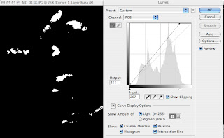
Clipping is what happens when you under- or overexpose and image in camera or over-correct in software. It simply means losing information or detail in that area. When you photograph you can use the highlight warning control (or the “blinkies”) to check for clipping as you work. You can also check for clipping as you work on images in software, especially when doing contrast correction or change. If you look at the Curves control you’ll see a check box that says “Show Clipping.” Check that ON and as you move the sliders the screen will go blank, dark for the highlights and white for the shadows. As you move the slider in toward the shaded histogram you’ll see details emerge—these are the clipped areas.
It is important not to create harsh edges in highlights, say on the bright clouds, when making contrast adjustments. This Curves dialog box shows the Show Clipping box ON. When an adjustment is made to the highlight area the clipping begins to show on the image (which has been masked with black) on the details where over-correction is applied. You can also see clipping in Levels by pressing down on the ALT/Option key when making adjustments.

Wednesday, March 17, 2010

Scanning for Black and White


Many of us who worked prior to the turn of the century, and even somewhat around that bend, shot with film. The following is for those who still work with film and combine film exposure and development with digital scanning and printing, to me a very good course to follow, and for those who have older film images they want to print or digitize. While I now photograph mostly with a digital camera, I also have lots of “legacy” film to work with, and recommend scanning and inkjet printing as the most sensible and creative means to realize those older images.

The main thing to keep in mind when scanning is to “do no harm.” There are various schools of thought on this, but my approach has always been to get as much image information out of the film as possible without doing any, or many corrective procedures beyond that which the scanner might offer. The scanner is there to pull information out of the film record and turn that information to digital form. Scanner software can enhance that information or add to it; use it to record, not overly enhance. You should also scan at the maximum optical resolution of the scanner, and not to work with “interpolated” resolution, that is, to not add to the information through algorithms. If the scanner you use does not create the amount of information you require for your prints—in other words, produces less resolution that you need for a particular image size—then get another scanner or have the images scanned by a pro lab.

Scanners vary greatly in their specs and capabilities, and new models come out periodically, so I will not recommend or follow a particular hardware and software here. While dedicated film scanners (strip and sheet) will yield better results, a new generation of flatbed film scanner (for reflective as well as transmissive material, i.e., film) has changed the thinking on the need for a dedicated film scanner for film scanning. My choice is to work with a dedicated film scanner for 35mm and I use a flatbed for medium format.

It is a fairly simple matter to convert any color image to black and white, so you can scan color slides to color (RGB) or to black and white (grayscale) data. Most scanner software shares similar settings. You start with choosing the type of film then put in how you want the scanner to handle the film. You can scan at 16-bit grayscale, which pulls much more information than an 8-bit scan or even in color, and then convert later in software to grayscale. You then put in the “output” size, which is final print size, and also the resolution, usually 300 dpi. The software calculates the rest. Keep in mind that if you are scanning solely for black and white, choosing 48-bit color increases file size substantially.

Many scanners offer presets of various sorts, which you should test to see if they help or hinder your work. These vary from presets for film profiles, such as various types of slide and color negative films, to tone curve and color cast renditions, which can affect black and white conversions.

The mantra is “do not harm”; don’t add contrast, try to fix every exposure flaw etc in scanning. Get all the information you can from the film and then work the problems later in software. If you keep the tonal richness and detail of the original in your scan you allow the most leeway later in your image interpretation, or best chance for an faithful reproduction of the scene. It’s the same gospel as that of camera exposure. Even slides that have begun to lost dye integrity over time can be “salvaged”for black and white printing.

8 Scanning Tips

1) When scanning color negatives or slides you can scan for color or black and white. It’s easy to convert to black and white later in image editing software.

2) Scan at the highest bit depth available.

3) Test the dust and scratch removal software in your scanner to see if and when it causes unsharpness. It can help save retouching time later (except on black and white negatives and Kodachrome slides, on which it usually does not work.)

4) Scan for the highest non-interpolated resolution you think will be necessary. Do not resample in the scanner software. Never exceed the scanner’s optical resolution.

5) DO NO HARM. Do not try to enhance contrast too much or fix contrast or exposure problems; save that for the image editing software.

6) Watch for highlights. If necessary, do lower contrast in the scan phase. You are collecting information, and if you do not record the information in the scan you will not have it to work with later.

7) Think big, but be reasonable. There is a limit to how big a print you can make from various size format film. Test to see the limits of your scanner and don’t expect to solve all your problems in the scanner phase of things.

8) Scan neutral, create in software later for expressiveness.


Photos and text copyright 2010 George Schaub: Scanning can help preserve even faded or dye challenged slide film. This old Ektachrome slide was undergoing a magenta shift, but scanning it for b&w printing allowed the image to be useful again, and a nice print resulted.